Deliverables
UX Research
Wireframes
Lo-fi Prototypes
Usability Testing
Hi-fi prototypes
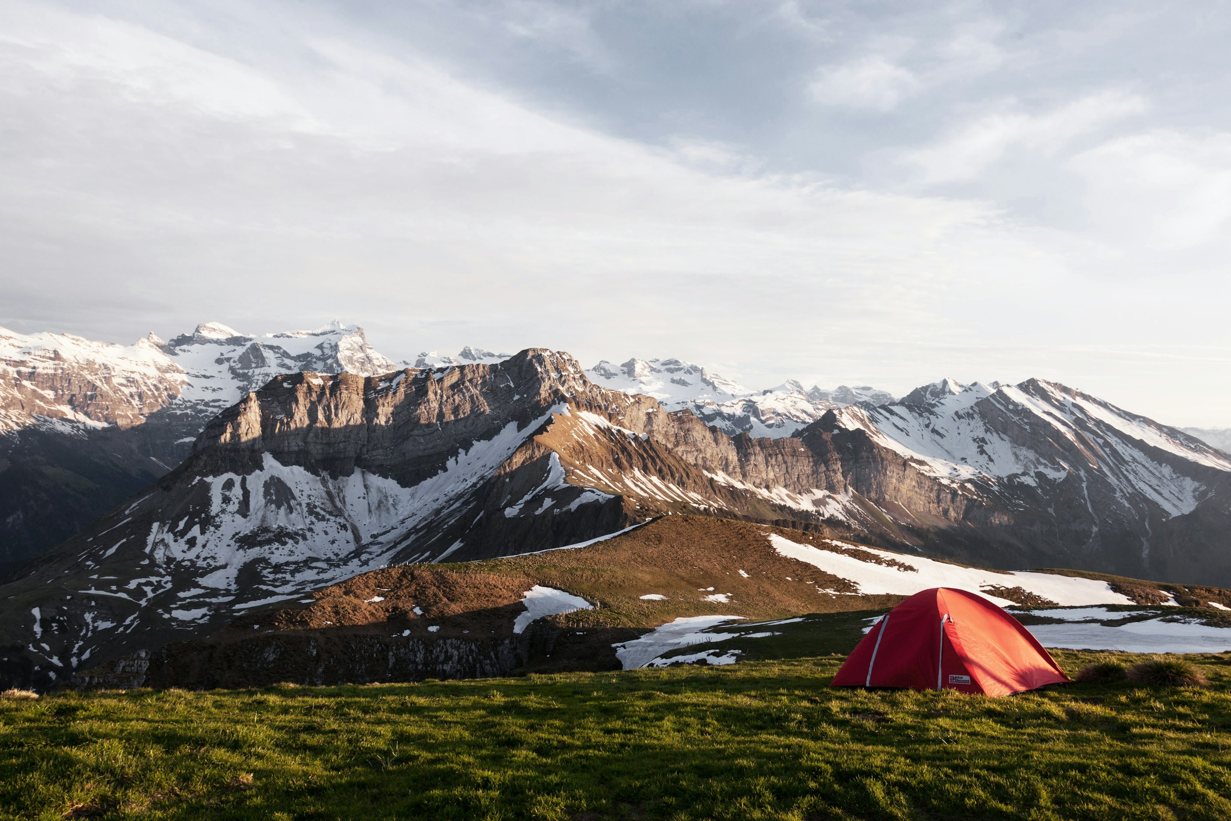
Camping supply store
Basecamp is a fictional online store for camping gear and outdoor supplies for adventurers of all levels, from first-time campers to outdoor experts.
First-time users can get overwhelmed with specific gear and outdoor experts want a reliable store to shop. The goal was to create an experience tailored for both cases.
Project Overview
Research
Understanding the users
Beginners at camping want simple gear and don’t know the technical aspects. Outdoor enthusiasts want a reliable store with high-quality equipment.
Methodology
The research conducted was based on informal conversations about camping and the experiences of buying camping gear.
Research results
As a result of the user research, the feature of a quiz was created to determine the ideal starter pack for the beginner user.
Key Findings
- Too much information about specialized products can be overwhelming for inexperienced users
- Beginners at camping can end up buying things they will not use
- Unpleasant aesthetic can cause users to leave the app/website
Project Overview
Shopping
This fictional product was created as a final project of Google UX Design course in Coursera. This was my first experience of designing a whole product, and although I can now see how it can be improved, I’m proud of what I achieved, given the knowledge and experience I had at that time.
Project Overview
Shopping
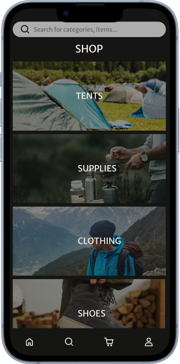
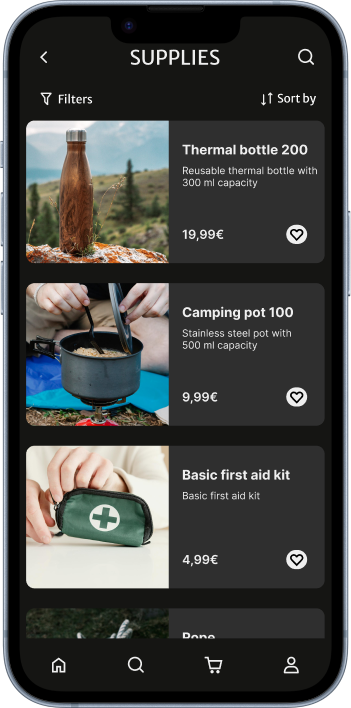
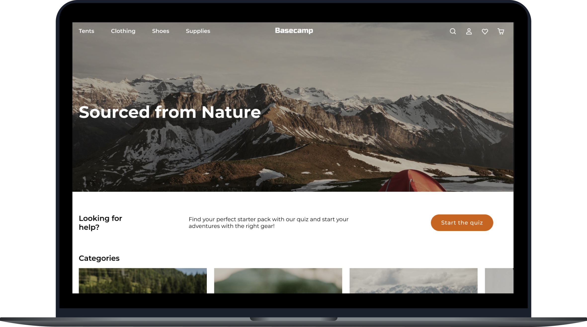
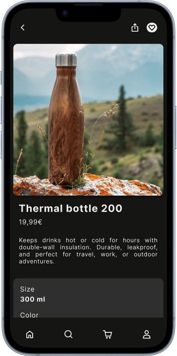
Besides the quiz, users can have a regular shopping experience, with the gear separated by categories and with a product page, so the user can have all the detailed information before buying.
Project Overview
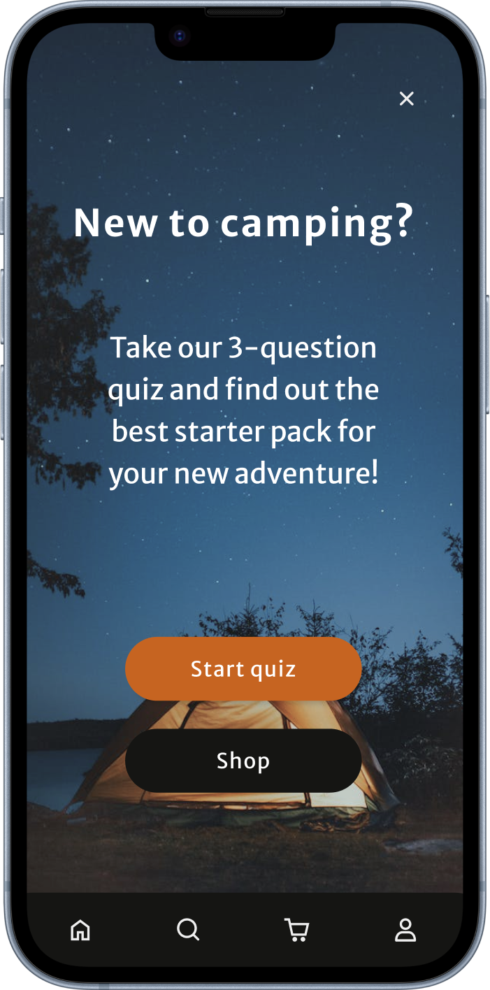
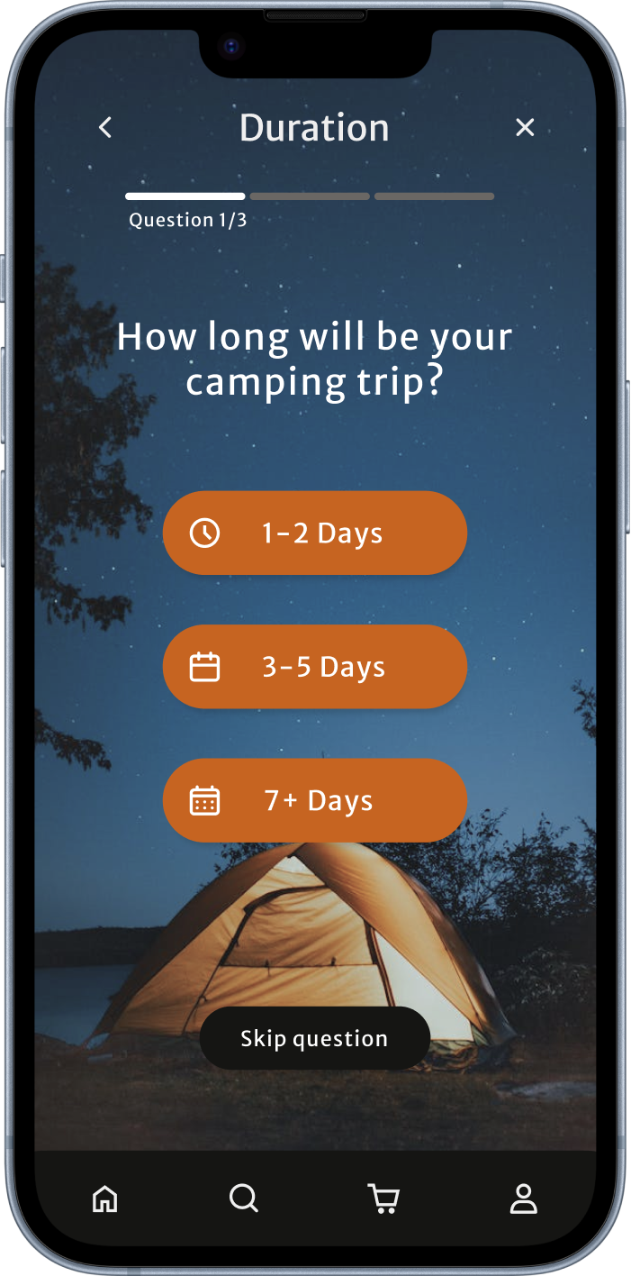
Quiz Feature
With the quiz feature, the beginner user can quickly have a starter camping pack adapted to the answers given. This way, the user is not easily overwhelmed and reduces the chance of buying things they don’t need.
Project Overview
Shopping
This fictional product was created as a final project of Google UX Design course in Coursera. This was my first experience of designing a whole product, and although I can now see how it can be improved, I’m proud of what I achieved, given the knowledge and experience I had at that time.
“Leave every place better than how you found it”
Contact

Deliverables
UX Research
Wireframes
Lo-fi Prototypes
Usability Testing
Hi-fi prototypes
Camping supply store
Basecamp is a fictional online store for camping gear and outdoor supplies for adventurers of all levels, from first-time campers to outdoor experts.
First-time users can get overwhelmed with specific gear and outdoor experts want a reliable store to shop. The goal was to create an experience tailored for both cases.
Project Overview
Research
Understanding the users
Beginners at camping want simple gear and don’t know the technical aspects. Outdoor enthusiasts want a reliable store with high-quality equipment.
Methodology
The research conducted was based on informal conversations about camping and the experiences of buying camping gear.
Research results
As a result of the user research, the feature of a quiz was created to determine the ideal starter pack for the beginner user.
Key Findings
- Too much information about specialized products can be overwhelming for inexperienced users
- Beginners at camping can end up buying things they will not use
- Unpleasant aesthetic can cause users to leave the app/website
Project Overview
Shopping
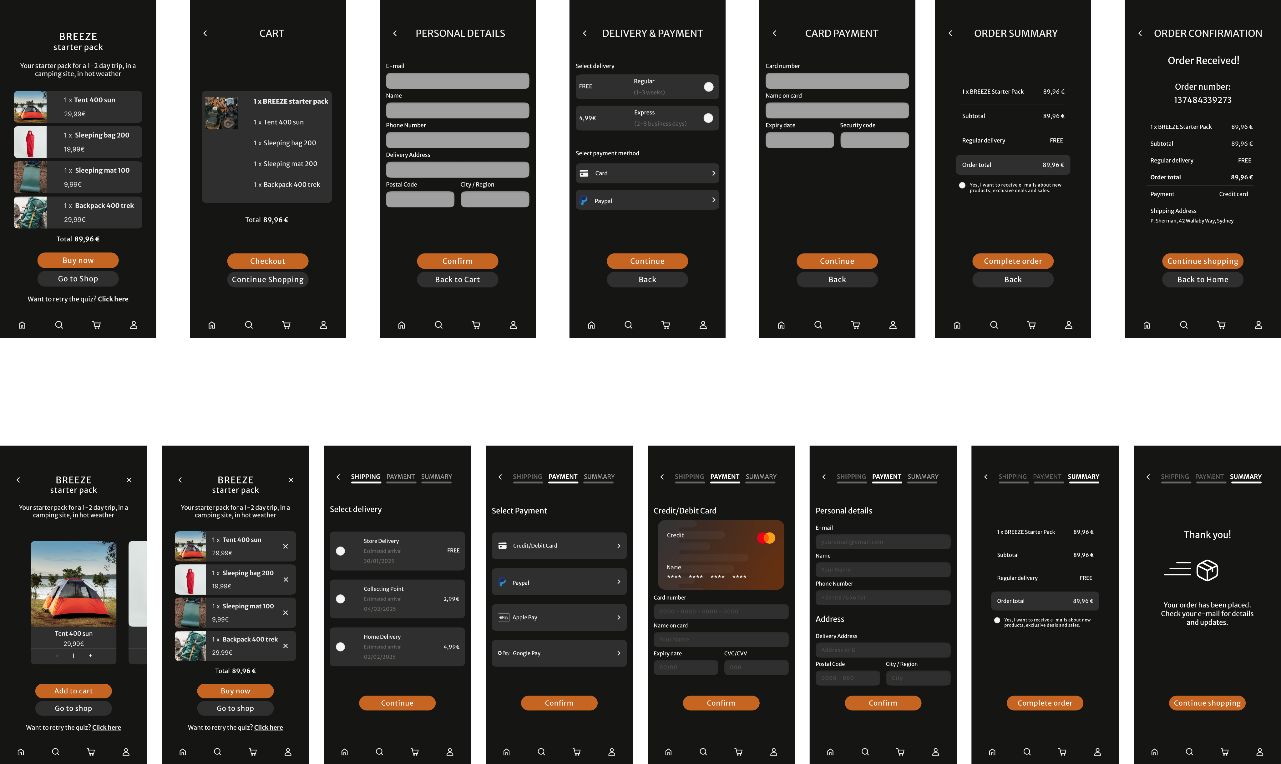
First Flow
The usability testing mainly revealed that the checkout process wasn’t clear and organized, so the user ended up not knowing what came after every step.
Second Flow
After the testing, the checkout was redesigned, detailing the process to the user and overall creating a better shopping experience (second flow).This fictional product was created as a final project of Google UX Design course in Coursera. This was my first experience of designing a whole product, and although I can now see how it can be improved, I’m proud of what I achieved, given the knowledge and experience I had at that time.
Project Overview
Shopping
Besides the quiz, users can have a regular shopping experience, with the gear separated by categories and with a product page, so the user can have all the detailed information before buying.
Project Overview
Quiz Feature
With the quiz feature, the beginner user can quickly have a starter camping pack adapted to the answers given. This way, the user is not easily overwhelmed and reduces the chance of buying things they don’t need.
Project Overview
Shopping
This fictional product was created as a final project of Google UX Design course in Coursera. This was my first experience of designing a whole product, and although I can now see how it can be improved, I’m proud of what I achieved, given the knowledge and experience I had at that time.
“Leave every place better than how you found it”
Contact