Deliverables
Wireframes
Lo-fi Prototypes
Hi-fi Prototypes
Expense Management Tool
An expense management tool to control and view regular and occasional expenses. The client was a developer and requested the design only for the expenses., using the design system Daisy UI. The next steps for this project include adding new features to improve functionality.


50,00€

Project Overview
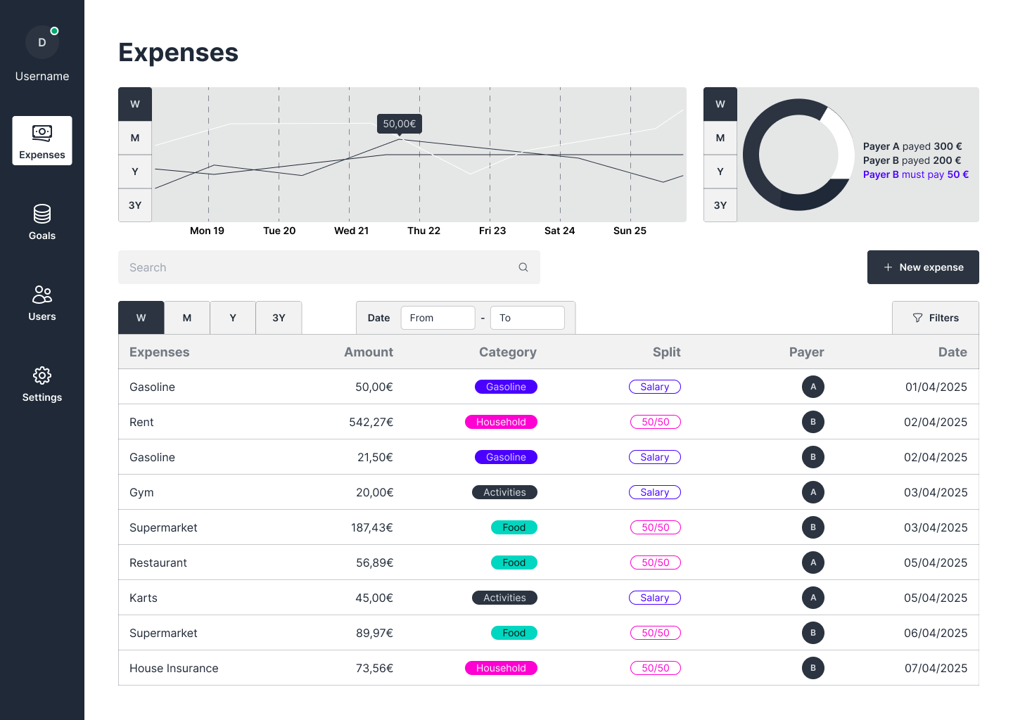
Easy Expense Viewing
The user might check their monthly expenses in the table and use the chart to see how much they spend each week. This way, they get a better overview and can find patterns more easily.
The table is organized in a way so that the user can keep track of the expenses by amount, category, date, who payed the bill (option for multiple users who share the same household) and method of splitting the bill (50/50 or according to another percentages).
Project Overview
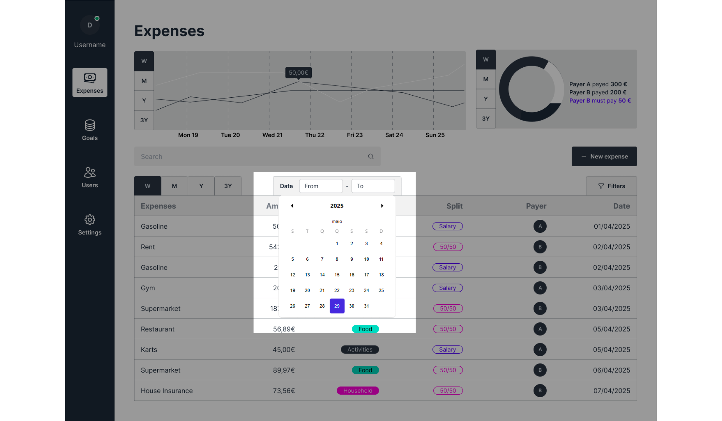
Date Viewing
The user may change the viewing date on the table according to a certain period. This feature makes it simple to track spending in specific days, weeks or months.
Project Overview
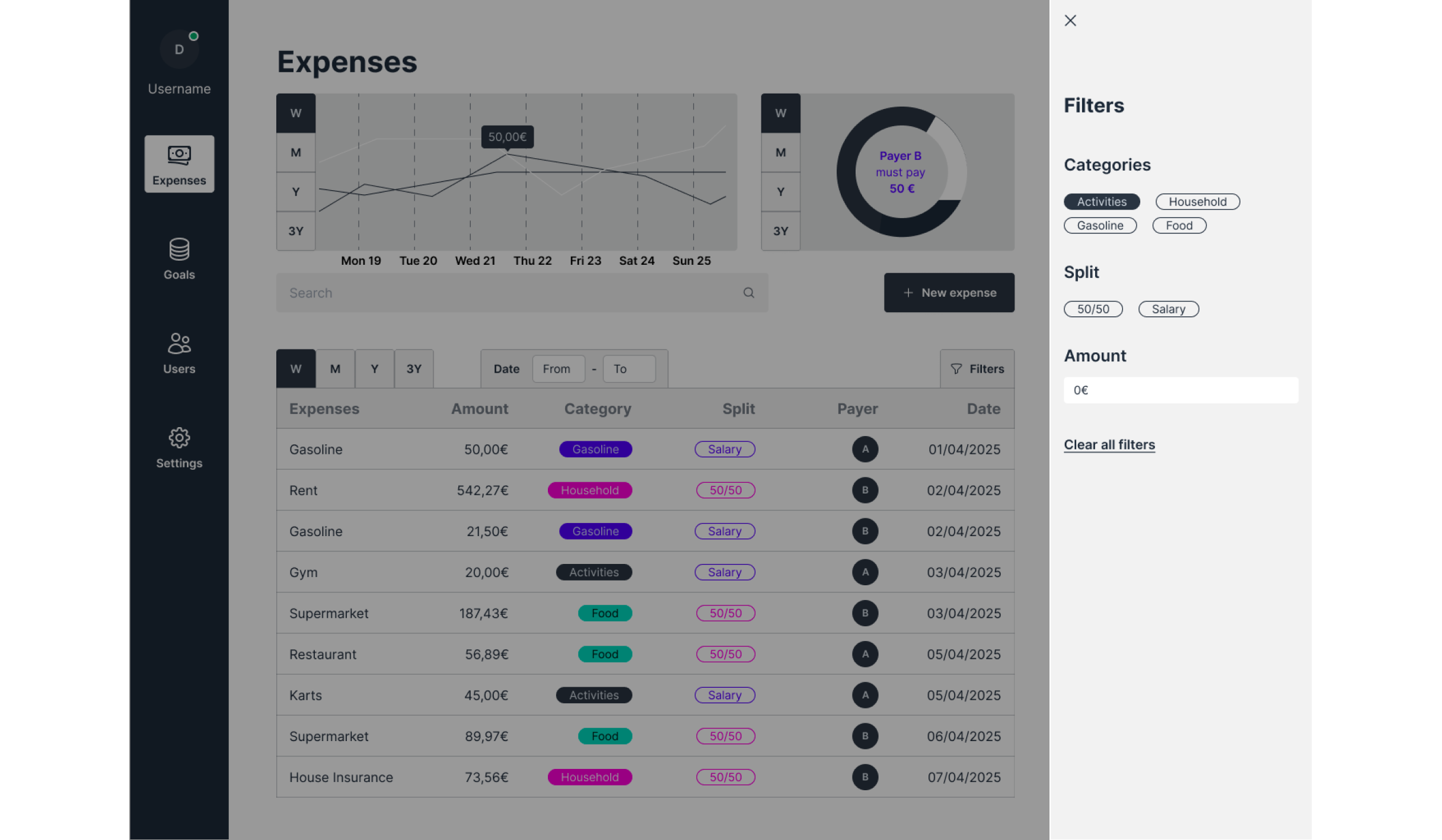
Filters
A simple filter section to better search for expenses, making it easy for the user to find specific expenses. The option to clear all filters makes it simple to start a new search anytime.
Project Overview
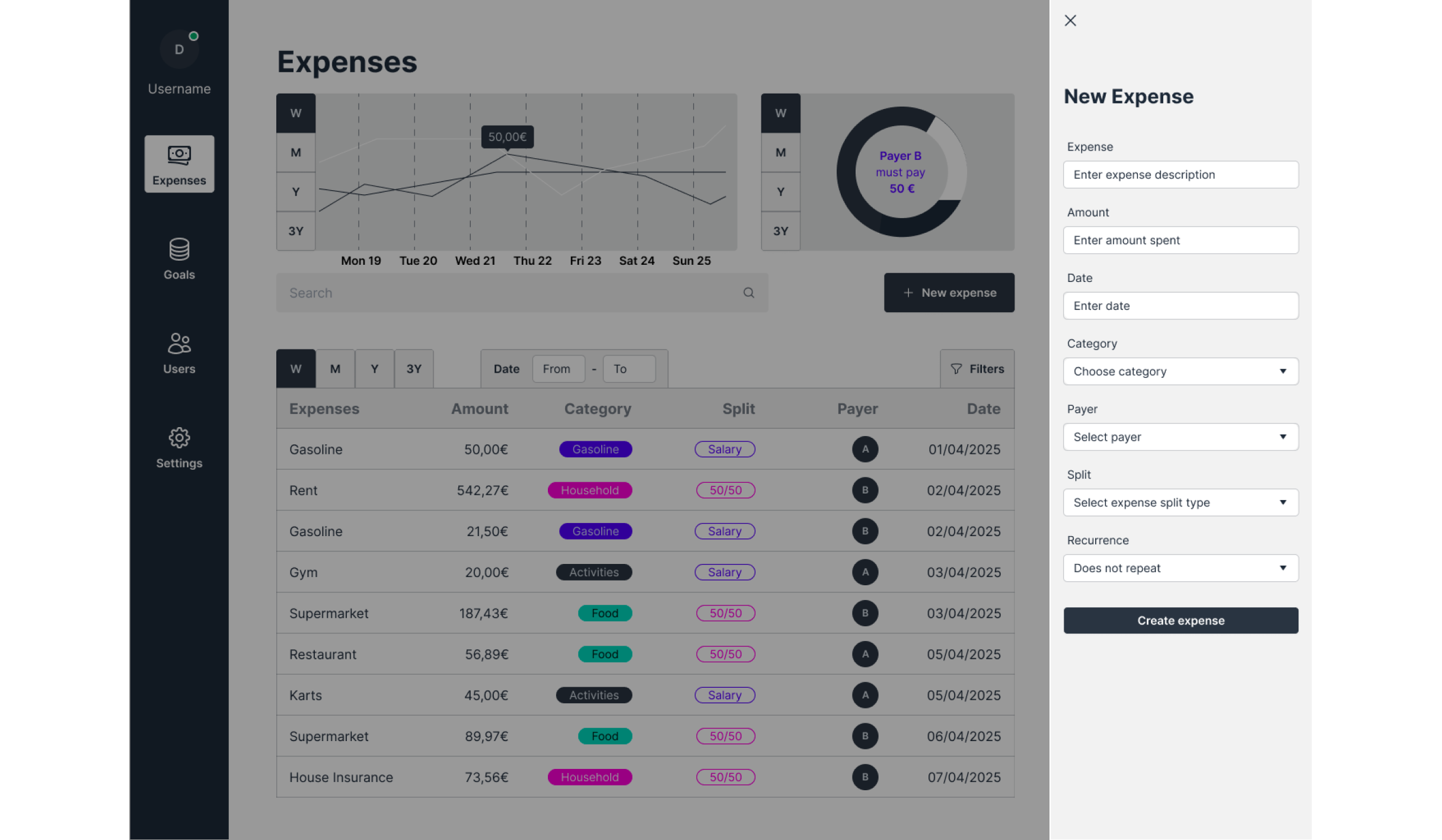
New Expense
Using the sidebar for actions keeps the screen uncluttered. This way, the user doesn’t lose sight of the main data.
Project Overview
Filters
A simple filter section to better search for expenses, making it easy for the user to find specific expenses. The option to clear all filters makes it simple to start a new search anytime.
“Leave every place better than how you found it”
Contact

Deliverables
Wireframes
Lo-fi Prototypes
Hi-fi Prototypes
Expense Management Tool
An expense management tool to control and view regular and occasional expenses. The client was a developer and requested the design only for the expenses., using the design system Daisy UI. The next steps for this project include adding new features to improve functionality.


50,00€

Project Overview
Easy Expense Viewing
The user might check their monthly expenses in the table and use the chart to see how much they spend each week. This way, they get a better overview and can find patterns more easily.
The table is organized in a way so that the user can keep track of the expenses by amount, category, date, who payed the bill (option for multiple users who share the same household) and method of splitting the bill (50/50 or according to another percentages).
Project Overview
Date Viewing
The user may change the viewing date on the table according to a certain period. This feature makes it simple to track spending in specific days, weeks or months.
Project Overview
Filters
A simple filter section to better search for expenses, making it easy for the user to find specific expenses. The option to clear all filters makes it simple to start a new search anytime.
Project Overview
New Expense
Using the sidebar for actions keeps the screen uncluttered. This way, the user doesn’t lose sight of the main data.
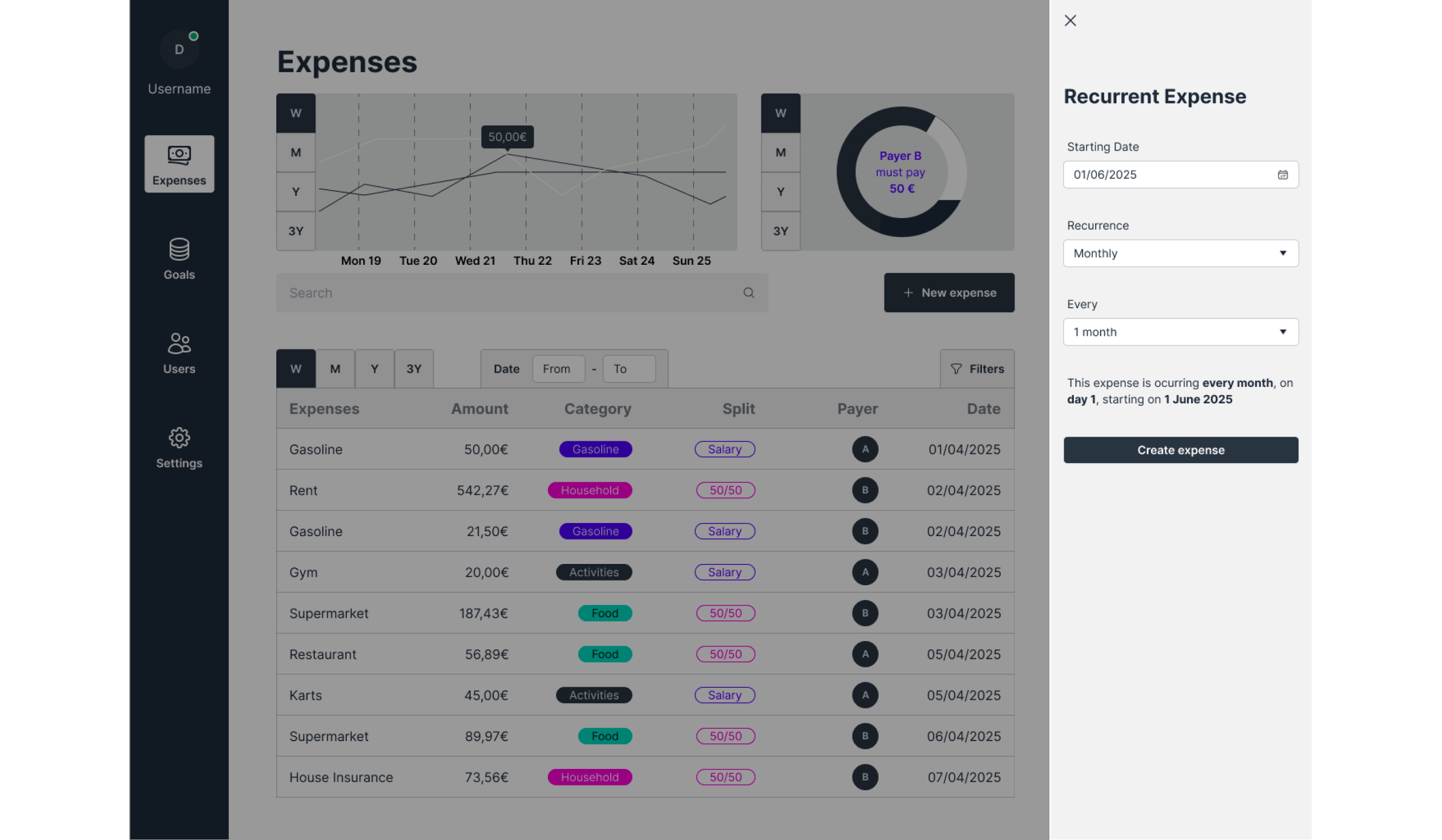
Project Overview
Recurrent Expense
When the new expense is a recurrent expense, the next step is to define the recurrency of that expense. This feature is ideal for fixed expenses like rent or health insurance.
“Leave every place better than how you found it”
Contact